Design systems are the backbone of fast and scalable product development. Today, a robust design system isn't just nice to have, it's essential. Whether you're designing in Figma, building React or Next components, or working with Tailwind CSS, the need for a flexible, scalable system is clear. That’s where ShadeUI, a modern design system built for speed and clarity, stands out.
Why do design systems matter in 2025?
Design systems save time, reduce inconsistencies, and enable seamless collaboration between designers and developers. They act as the foundation for design decisions, everything from typography and spacing to buttons, modals, and interaction states. Without one, even small teams waste hours recreating components or fixing visual drift across screens.
What makes ShadeUI different?
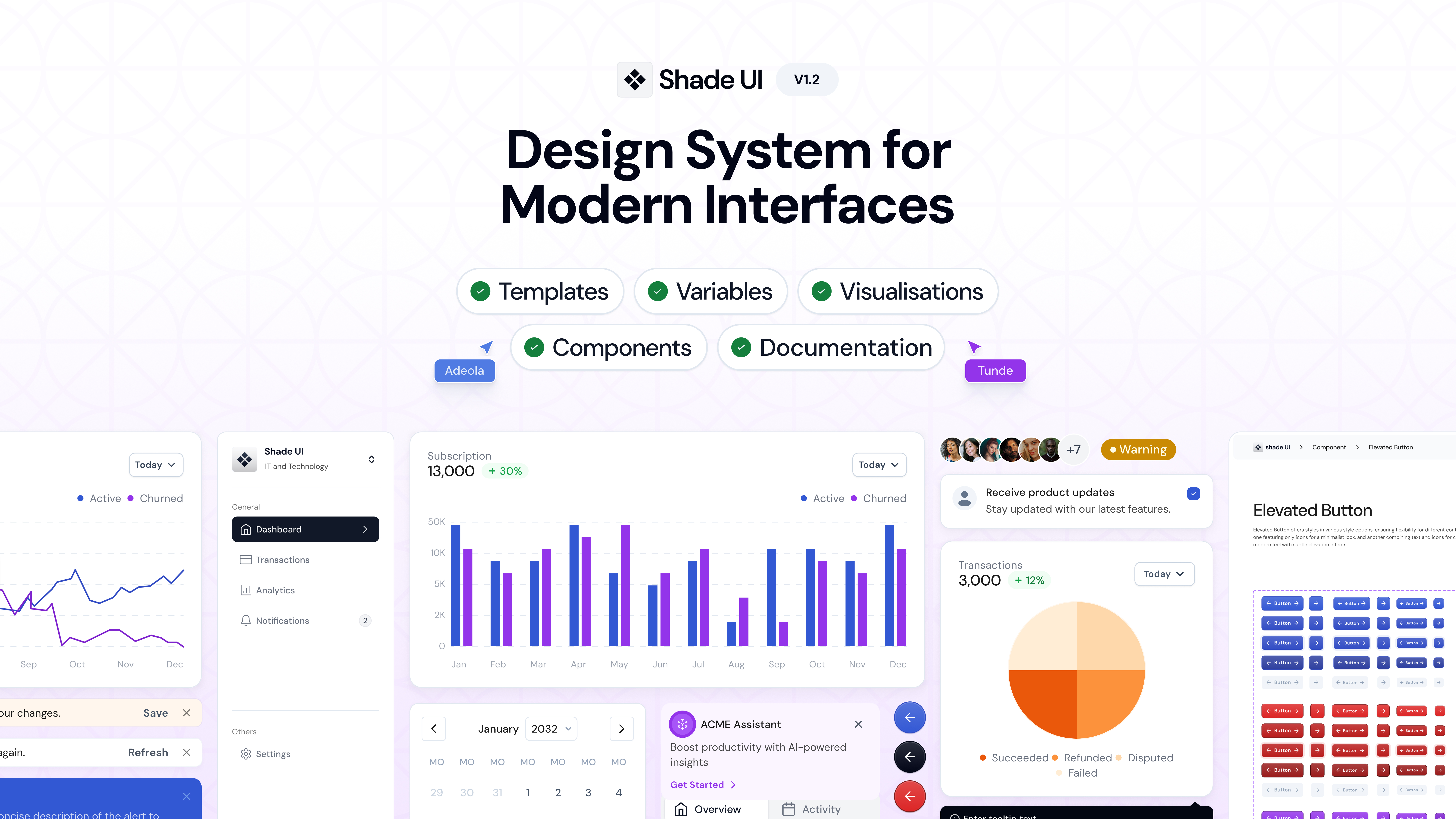
ShadeUI is a Figma first design system built to serve creators, startups, and modern frontend teams. It’s intentionally minimal perfect for makers who want a strong starting point without unnecessary complexity.
- Figma design token for typography, grids, spacing, and a beautiful grayscale palette with accent colors.
- React, Next and Tailwind Support to use prebuilt UI components styled with Tailwind CSS and optimized for real products.
- Lightweight and modular to add only what you need. No bloat, no heavy setup.
- Perfect for Developers & Designers to build with design-engineering workflows in mind.
If you’ve searched for a lightweight design system for Tailwind, or a React component library with matching Figma files, ShadeUI might be exactly what you’re looking for.
Who should use ShadeUI design system?
- Early-stage startups building MVPs
- Designers collaborating closely with engineers
- Web developers looking for flexible UI kits
- Product teams that want to ship faster
A faster way to design
Design systems should empower creativity, not slow it down. ShadeUI gives you the foundation you need to create fast, accessible, and visually consistent user interfaces without the overhead. If you’ve been looking for a fast, elegant way to unify design and code, ShadeUI is built to help you move faster with less friction. Check out the latest version ShadeUI design system v1.2 to explore our design system.